Accessible ordering
What does it feel like to have your needs ignored as a user?
Imagine ordering food at a counter and the employees refuse to answer any questions you have or even take your order. This is the feeling and experience of some visually impaired people ordering food on a platform that is not accessible.
The Problem
According to DoorDash, food delivery is the most popular way to engage with a restaurant in the US (70% of consumers report ordering delivery, 70% report picking up takeout, and 68% report dining in at a restaurant). Through our evaluation and testing with visually impaired users, it became clear that tolerating frustrating or even broken experiences was the norm for them.
When I struggle ordering food online, I feel like this food better be good because it was so hard [to order]… sadly this is normal for many restaurants.
— visually impaired participant —
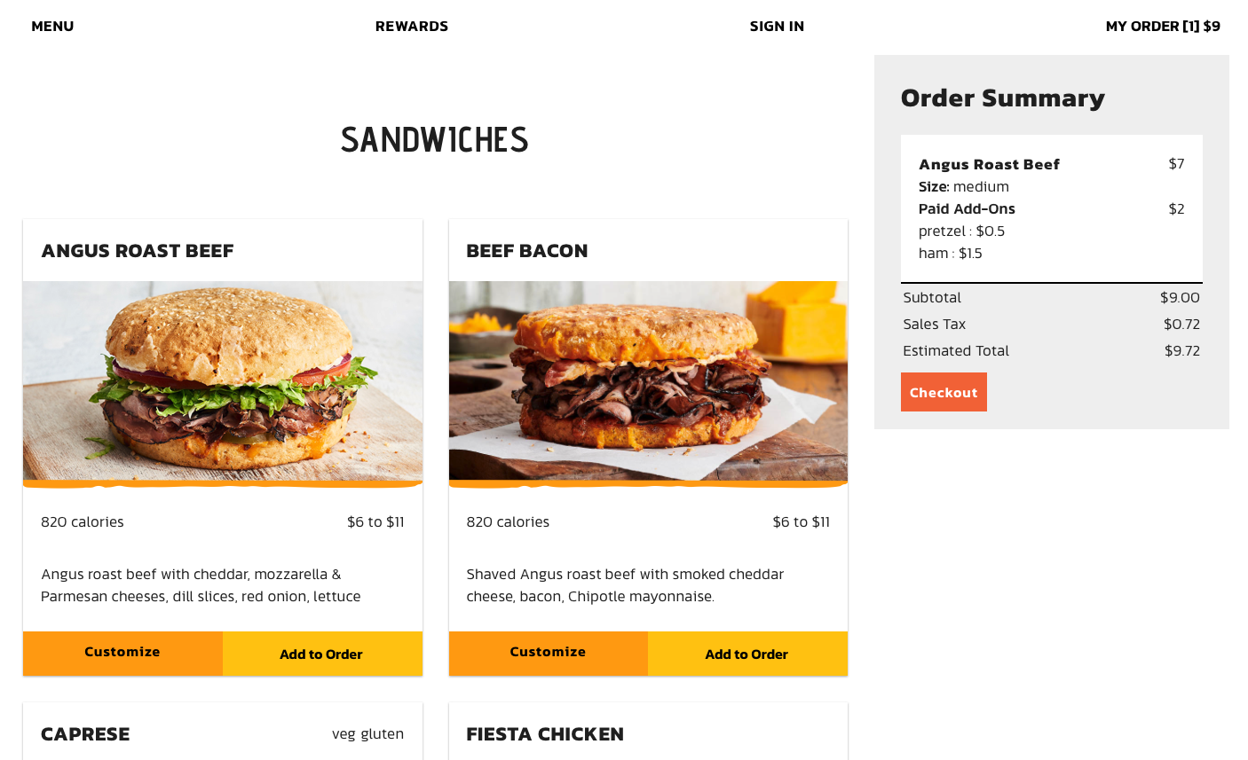
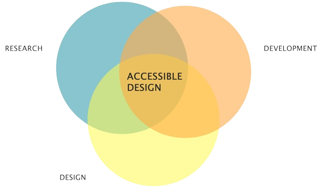
This project involved taking an accessibility-first approach to design an online ordering platform for Schlotzsky's, a fast casual sandwich franchise, with an emphasis on users with visual impairments who use assistive technologies (e.g. screen readers).
What are screen readers?
The most common way visually impaired users are able to read content online is through the use of screen readers. Screen readers are a form of assistive technology on computers and phones which enable people with visual or reading impairments to hear rather than read content. Screen readers typically read through a website from top to bottom. Users can move from one content selection to the next by either pressing the tab or arrow keys. There are specific quirks about this interface that must be understood in order to effectively design for these users.
What I accomplished
- Designed and executed research plan applying a variety of research methods across multiple iterations.
- Conducted baseline testing with users to evaluate existing ordering platform.
- Designed and developed custom code-based prototype built using HTML, CSS, and JavaScript out of necessity to accurately test visually impaired users and fine-tune prototype over multiple iterations.
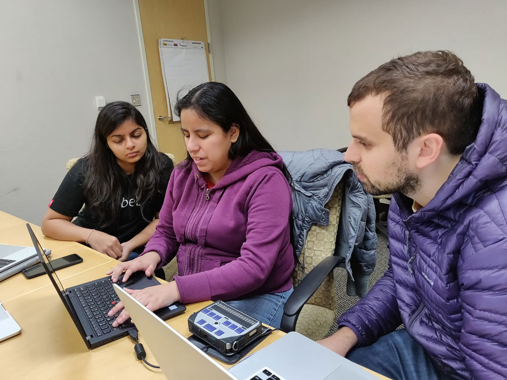
- Recruited and contextually interviewed visually impaired participants as they interfaced with a screen reader to use ordering platform.
- Designed and tested alternative companion interfaces for online ordering and tested them with visually impaired users (chatbot and voice interface).
- Conducted benchmark testing between prototype and a competitor where users ordered a sandwich using both platforms.
[Your website] is so much faster - it’s so much easier, very streamlined. It's a really simple process to get used to. There’s nothing hidden about it.
— visually impaired participant —
Takeaways from accessibility user testing
Designing for accessibility can be challenging for newcomers
(Discussing competitor ordering platform) It’s a little confusing where things open and where the cursor goes. You don't get feedback on what actions you take and where you are in the site.
— visually impaired participant —
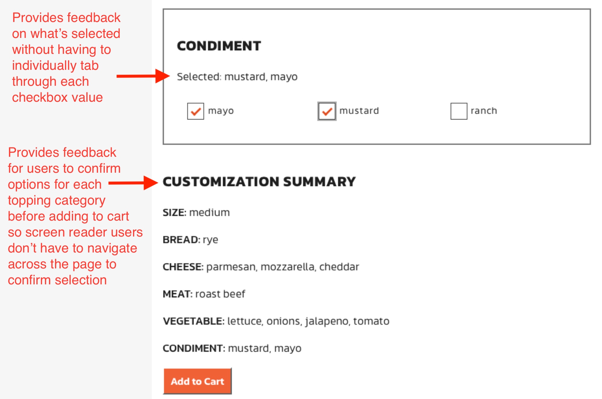
Accessible designs improve usability for everyone
I like that all the customization options are in headings and how it’s laid out.. it’s cool. I like that what’s selected is told at the top and that the customization options summary is at the bottom.”
— visually impaired participant —
Automated accessibility tools are a good place to start but no substitute to testing with users
Selected findings during testing
User action creates different result depending on context
“[Your website] is a lot clearer… a lot easier to understand than others. For example, most sites ask what you want to take off – and then separately ask you what you want to add. Checking an item means different things depending on whether you are within a remove or add area, which is confusing.”
— visually impaired participant —
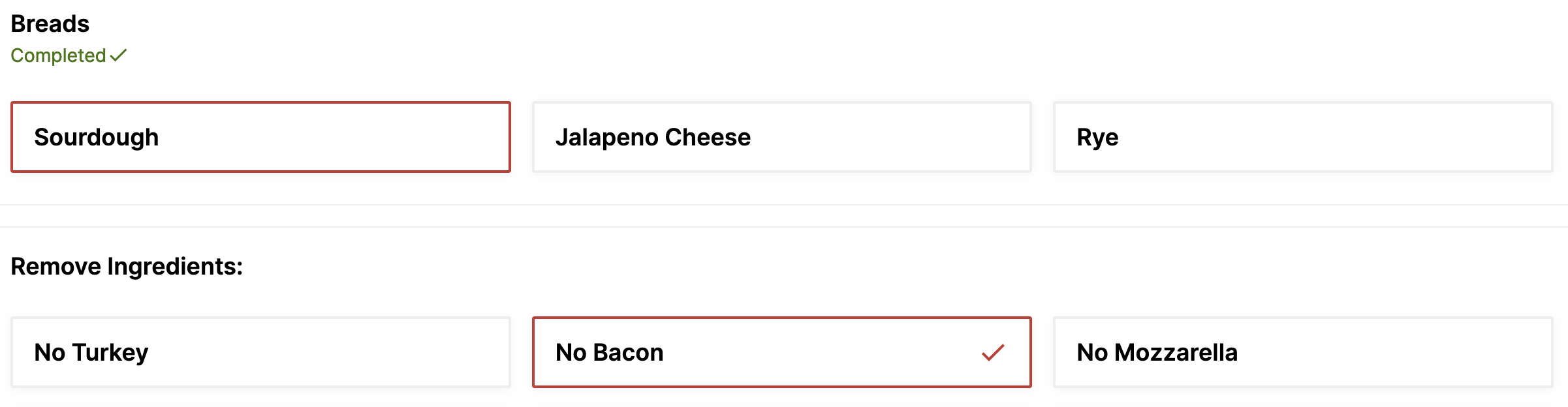
Relying on visuals to communicate options excludes visually impaired users
Some places I've ordered from won’t tell you what’s on a sandwich unless you go into those customization options. I like how [your website] tells me what on each sandwich without having to customize it. I think that’s helpful for restaurants with a ton of options.
— visually impaired participant —
Traditional voice interfaces (e.g. Alexa, Siri) are frustratingly slow for users of screen readers
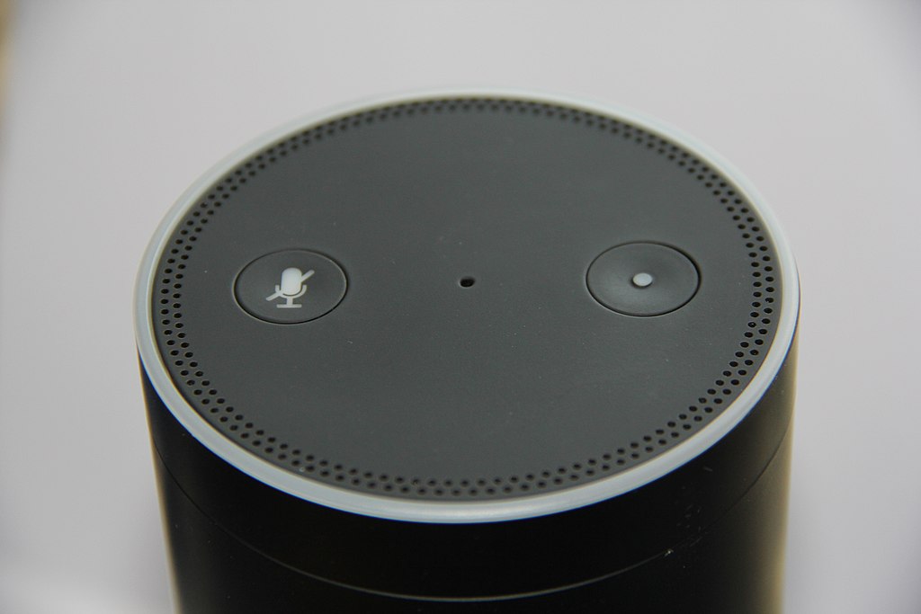
As part of this project we developed and tested a voice interface as an alternative interface for ordering food. Several of our users using screen readers became incredibly frustrated with the slow speaking rate of a our voice interface which is similar speed to a smart assistant like Alexa or Siri. It may seem obvious in retrospect, but at the time I did not connect the fact that screen readers speak nearly five times the speed of typical conversation.
Final prototype