CDC.gov CMS templates

The problem
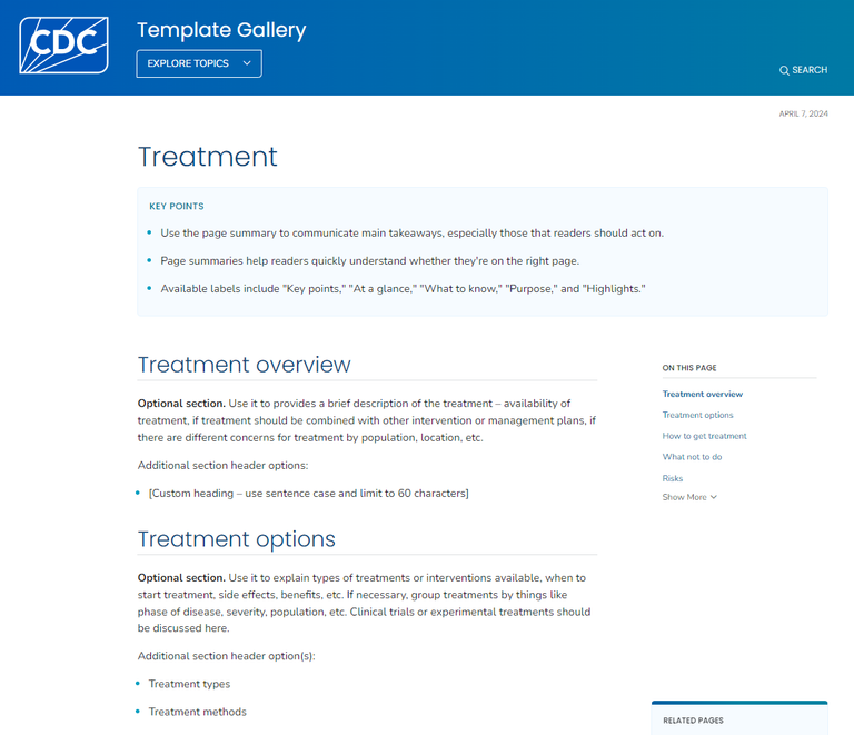
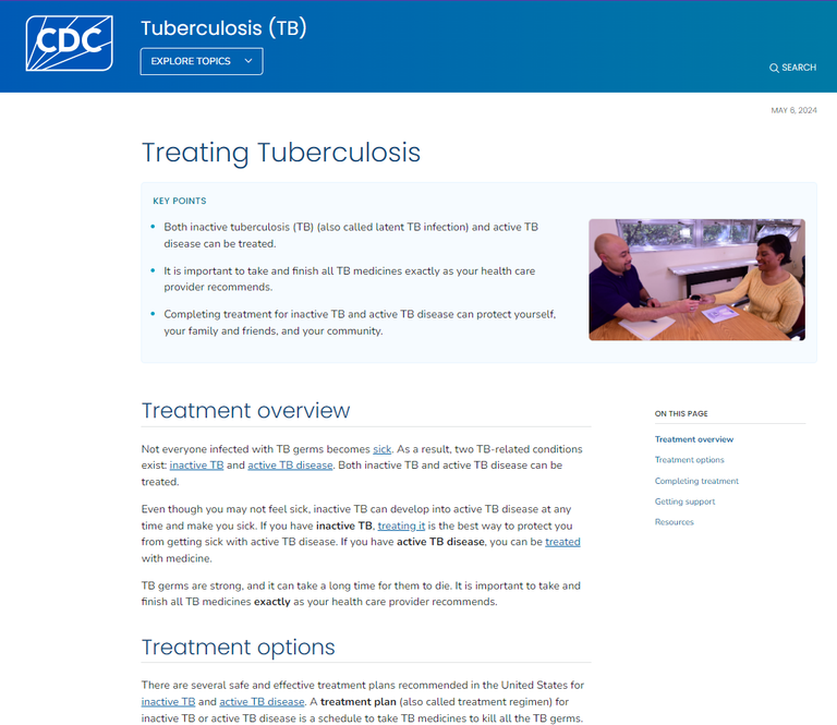
CDC.gov consists of many different program sites such as flu, chronic health, injury and prevention, etc. Each of these programs operated their website differently, including the structure of pages and content. This led to a fragmented and inconsistent user experience from site to site. Web staff from each program primarily focused on writing content, but struggled to create consistent page structures and follow best practices in writing and UX.
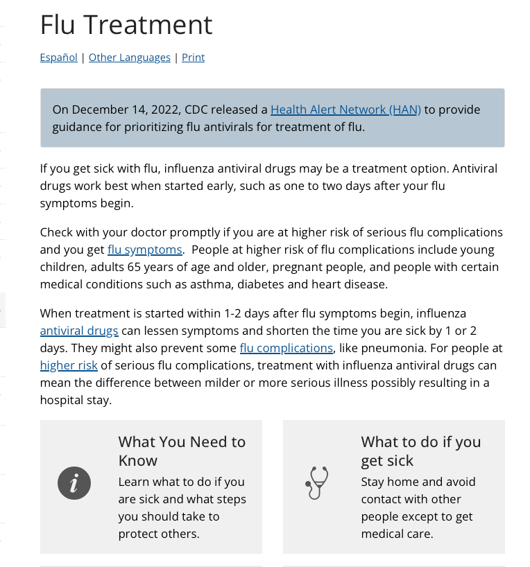
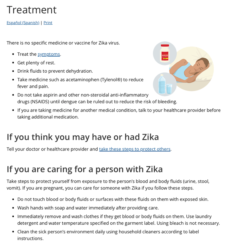
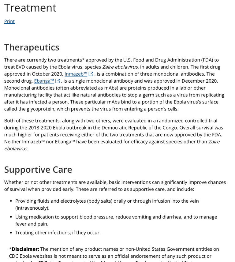
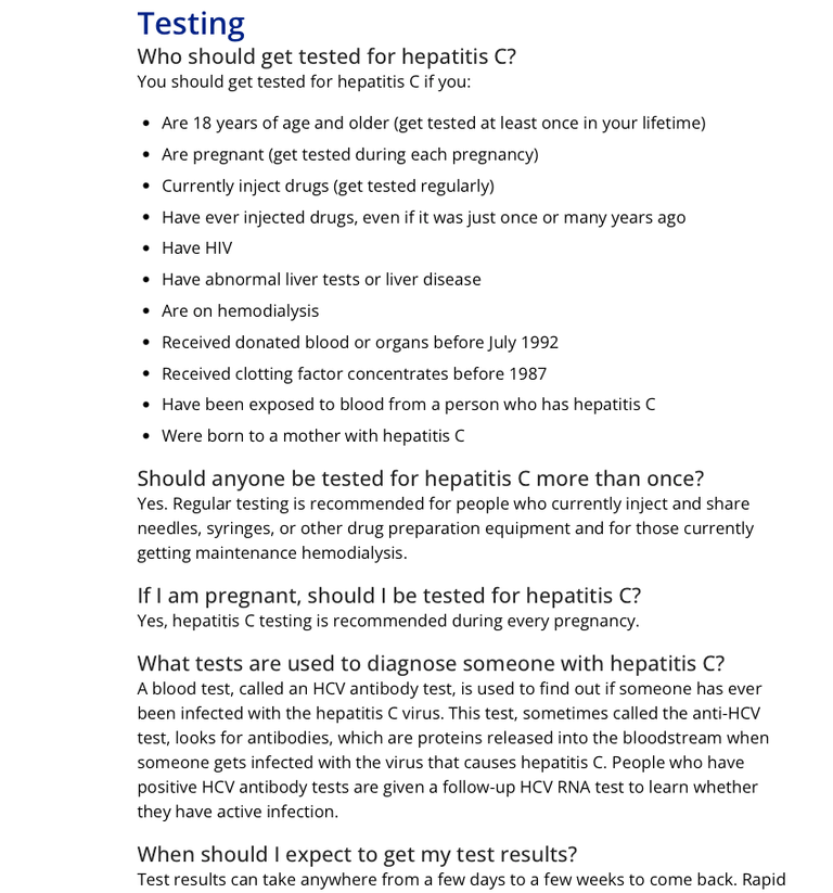
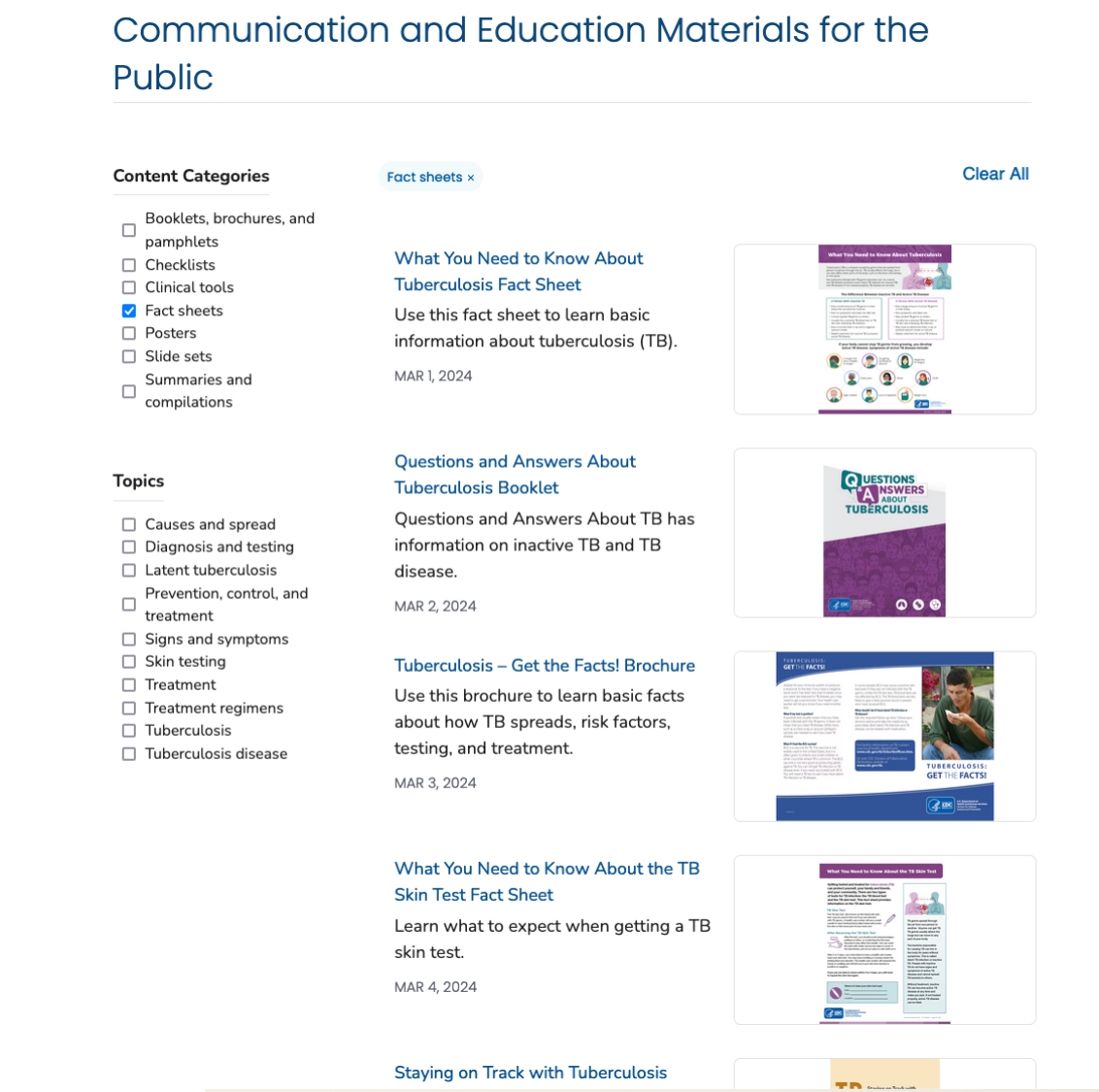
Let's think of an infectious disease site such as the flu. Nearly all infectious diseases have a similar set of pages such as symptoms, transmission, treatment, testing, and prevention. Below are examples of treatment pages across four different infectious diseases showing how much content structure varied between program sites before modernization efforts:
What I accomplished
- Helped develop 70+ standardized content templates that are used agency-wide.
- Developed and led testing strategy and efforts to refine 70+ standardized content templates improving page consistency across 40,000 pages.
- Improved information findability by 29% and achieved a user satisfaction score of 90% via UX insights.
The solution
Developed site-wide content templates
I worked alongside content strategists to develop 70+ standardized content templates through analysis of existing CDC pages. These templates covered all areas of CDC needs, including diseases/ conditions, environmental hazards, professional content, and organizational needs.
Testing and refining content templates
Although our team had an outline for all content templates, none of these templates had actually been tested or examined in a realistic scenario with content. With this in mind, I developed a unmoderated testing framework to rapidly test and iterate on these content templates.
The testing framework explored the following questions for each template:
- Are pages built from content templates actually understandable to users?
- Are the headings within templates clear to users?
- Is the ordering of sections logical to users?
- Can users reliably find information within pages built from these templates?
Ultimately, I led research and testing efforts for 70+ content templates across 476 users including the general public, health care providers, and public health professionals. These testing efforts played a crucial role in ensuring that content templates are optimized in regard to headings, layout, and findability. In addition, we gained valuable insights in regard to content structuring including the use of bullets, sub headers, bolding, and callout boxes that were incorporated into content writing guidance for CDC health communicators. User research based recommendations resulted in increased findability of information among users by 29% and a user satisfaction score of 90%.
The outcome
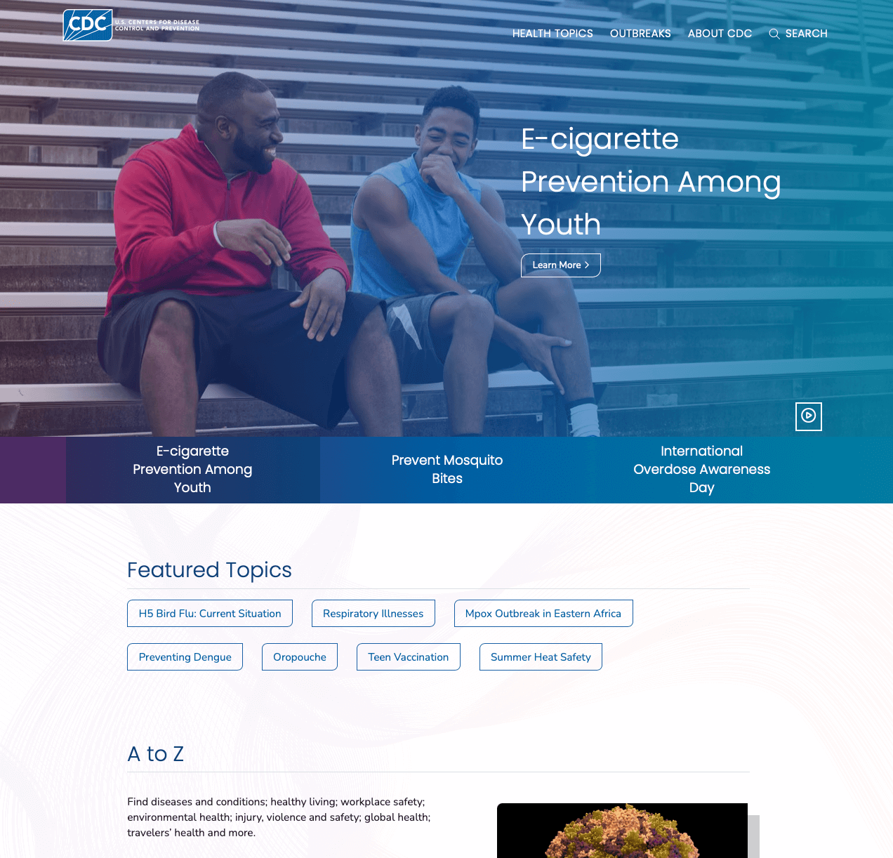
These content templates have been rolled out agency-wide at CDC.gov as part of a 2024 CDC relaunch providing consistent content-structuring for all pages. This enables users to have a more consistent experience when navigating between program sites. In addition, this enables content writers at the CDC to focus more on writing content knowing that the newly-developed content templates have best practices and research insights already baked in and are part of a agency-wide content strategy. In addition, another key outcome of implementing content templates was reducing redundant content on CDC's site by 60%.
The best thing about the site is the simplicity factor. The fact that the information is there, and it gives me just enough for me to learn what I need to learn without it being just too much. And if there's a certain topic that I wanna know about, I can click on that topic as opposed to having to read through an article and figure out the information that I need. So, I like that it’s broken up.
— research participant —
