CDC.gov navigation & redesign
The problem
CDC.gov consists of many different program sites such as flu, chronic health, injury and prevention, etc. Prior the our modernization efforts, CDC.gov had inconsistent approaches to design, layout, page components, and navigation depending on the program site. Each CDC program site often opted to choose their own color palette, one-off custom components, and manually curate their own navigation systems. This created a fragmented and inconsistent user experience and diluted CDC's agency-wide brand. In addition, all of these one-off, manually managed navigation systems/ components placed a significant burden on CDC staff in regards to upkeep and maintenance.
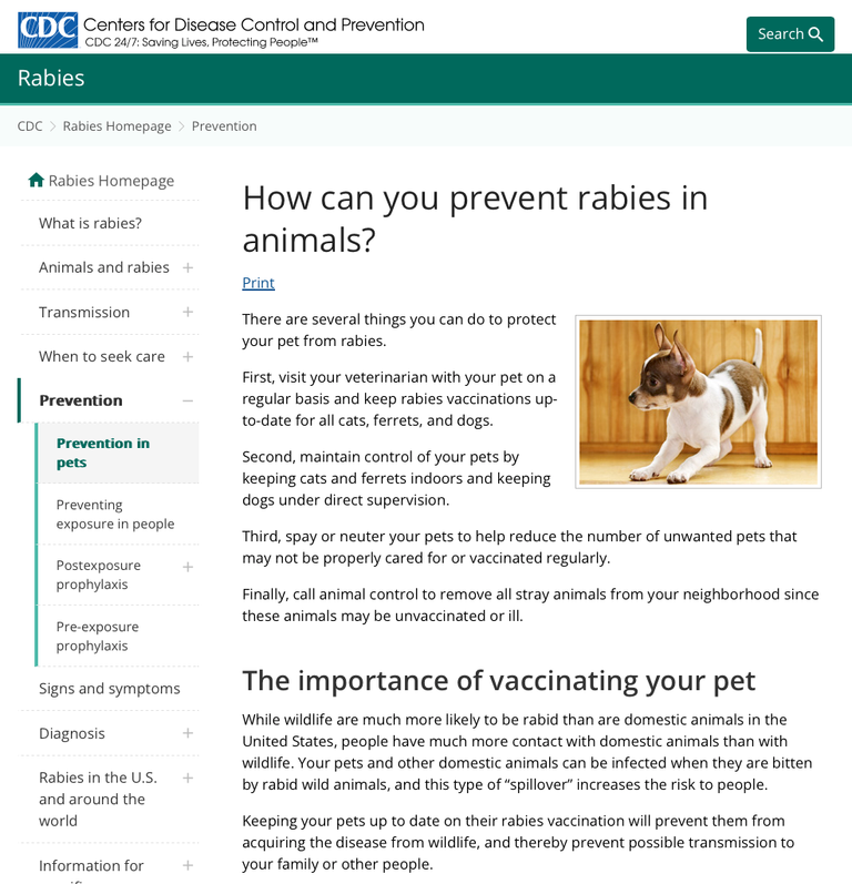
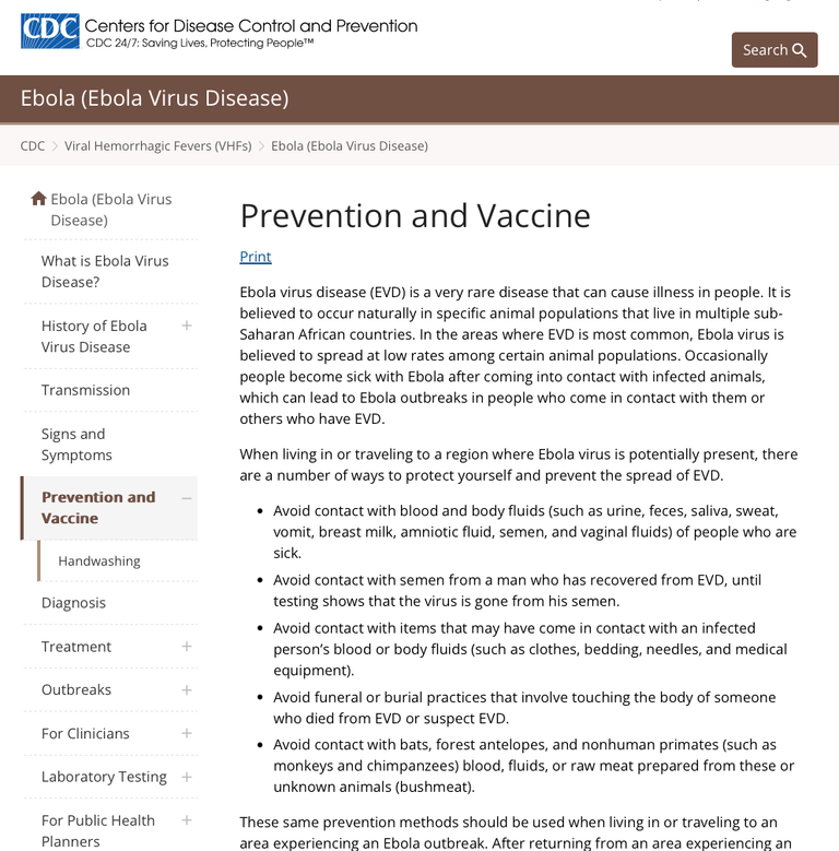
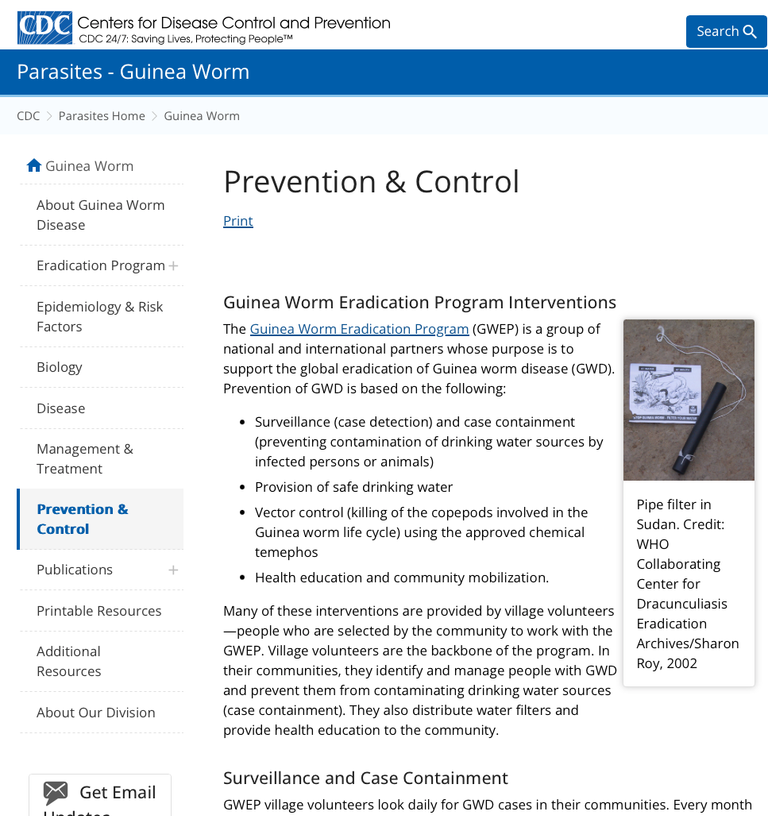
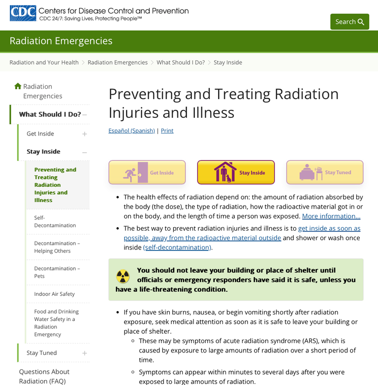
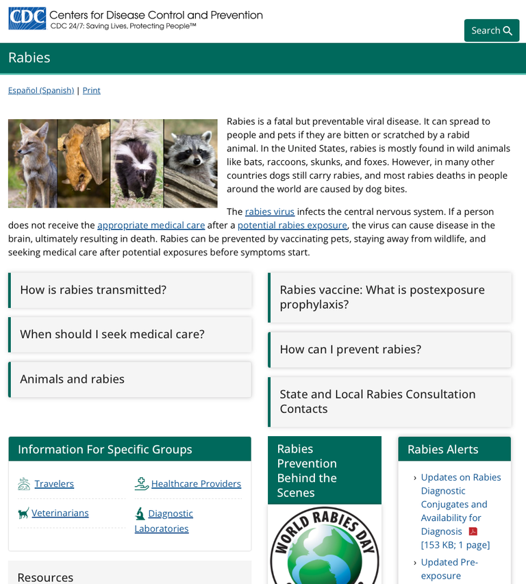
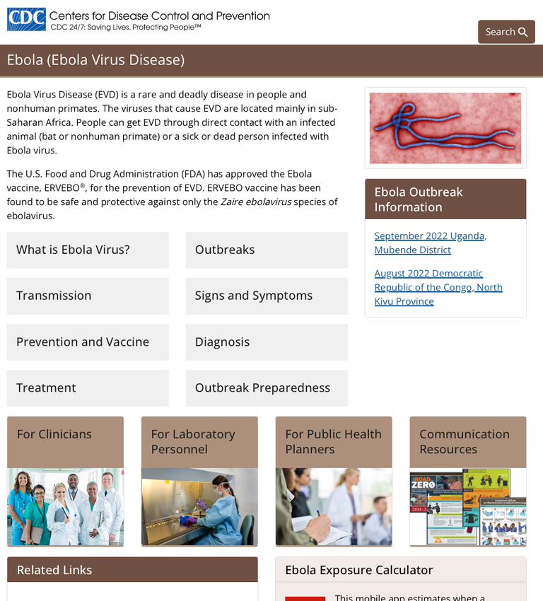
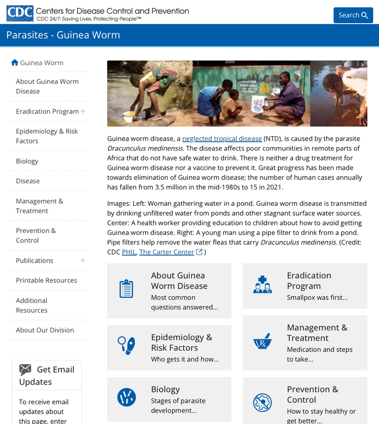
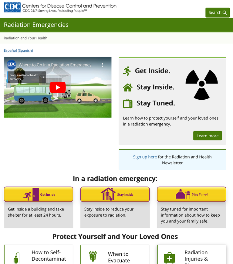
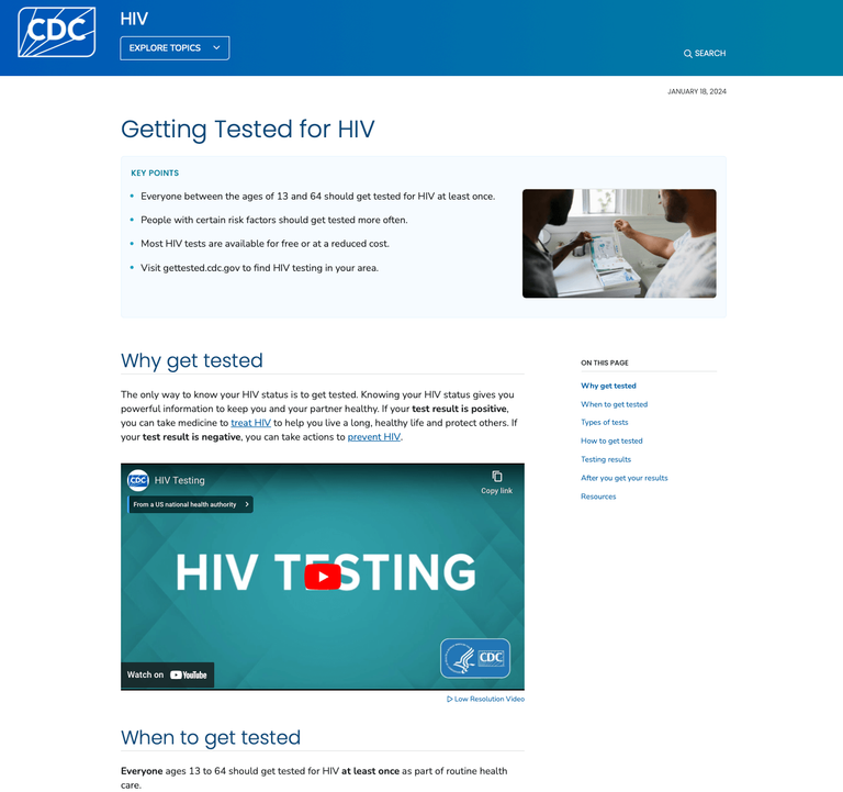
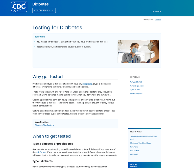
Below are pages from four different CDC program sites. Notice how each program used different colors, different page components, and a custom arrangement of links on the left hand side.
CDC content pages from 4 different program sites:
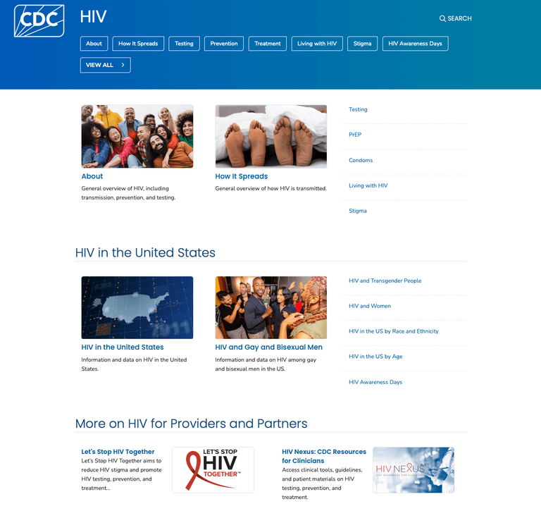
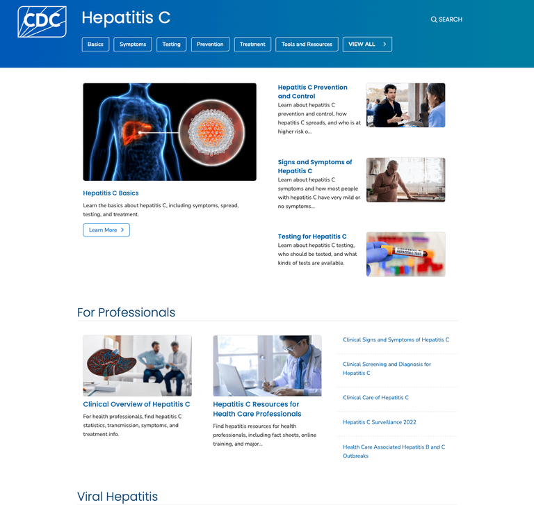
Not only were pages inconsistent, the homepages for each CDC program site often took radically different approaches to layout and design.
CDC homepages from four different program sites:
What I accomplished
- Worked on end-to-end multi-year modernization of CDC.gov delivering a standardized navigation system, page-/site-level components, and a consistent look and feel to CDC, which prior to modernization, had inconsistent approaches to design, layout, page components, and navigation.
- Led all research evaluating the website’s revamped design and navigation experience, collaborating closely with designers to iteratively make improvements through rigorous testing with 135 users. These efforts led to a 94% task success rate among users for navigating across pages to find information and a user satisfaction score of 92%.
The solution
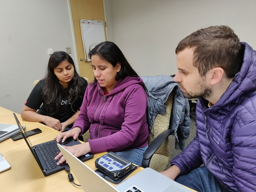
Empower modernization efforts through research
During the modernization efforts leading up to the CDC.gov relaunch, many programs were hesitant about making major changes to the status quo including changes in navigation and aesthetic. I regularly delivered research-based evidence that the CDC Director of Digital Media utilized to build confidence and gain buy-in from CDC programs in order to move agency’s modernization effort forward.
Here is a quote from the CDC Director of Digital Media in an interview with the federal news network:
Human Centered Design was absolutely the cornerstone of what we’re doing. We made every decision thinking about what the users needed. We did extensive research on our audience needs. We included many steps during the process to collect information from our audiences.
— CDC Director of Digital Media —
Develop and refine navigation model
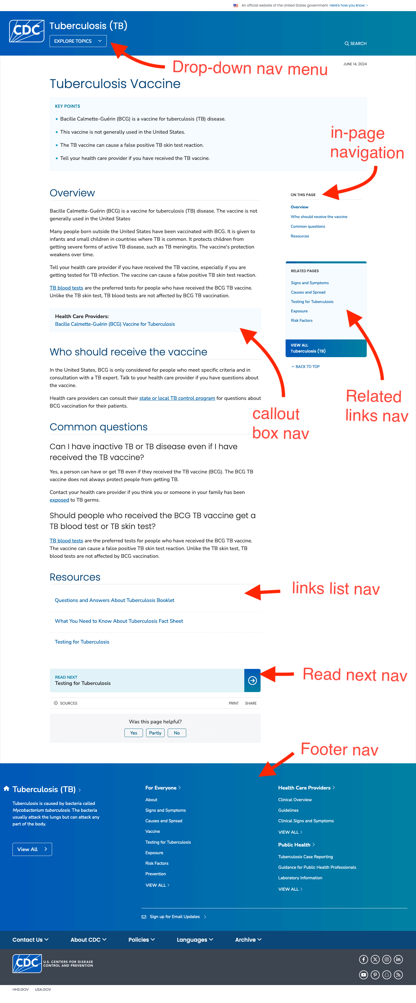
I designed and led all research studies relating to website’s new navigation model with 130+ users. I collaborated closely with designers from early on to iteratively shape and refine the navigation model and all related components. These efforts led to a 94% task success rate among users for navigating across pages to find information and a user satisfaction score of 92%.
The site is pretty much doing the work for me. I mean, I could go anywhere from what the risks factors are... causes and spread. I mean very easy. One click... two clicks max and I've gotten the information that I need.
— research participant —
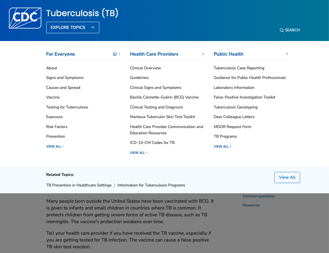
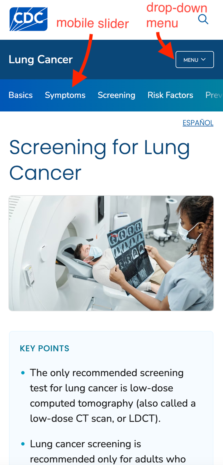
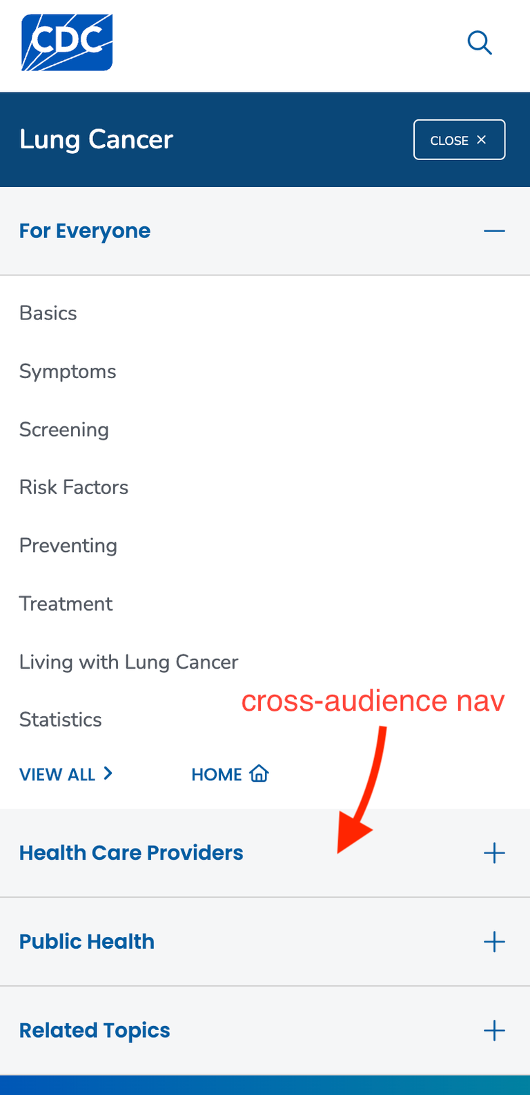
Mobile navigation features including mobile slider (left) and drop down menu (right):
Develop and refine new design/ aesthetic
I led all research efforts in relation to design/ aesthetic with 150+ users. This includes creating and designing all related research studies involved using a combination of surveying, unmoderated, and moderated studies. I worked at early stages of design with designers to shape the direction of major aspects of the CDC.gov design including the design/ aesthetic of content pages, topic homepages, and the CDC main homepage.
There's a lot of different areas that have a different look to them so it’s not just one static, medical journal type information. It’s more engaging than I would think.
— research participant —
The outcome
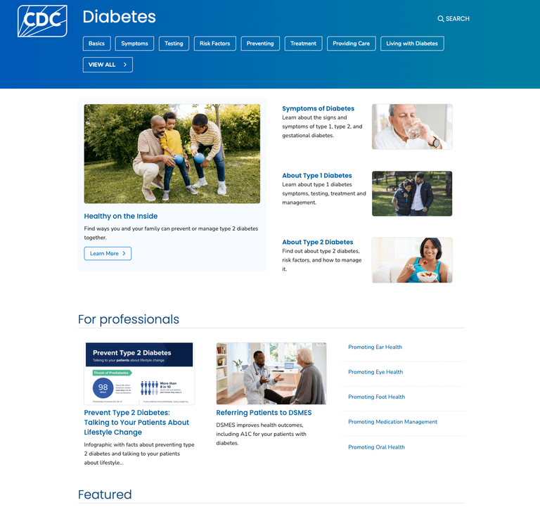
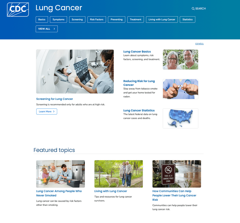
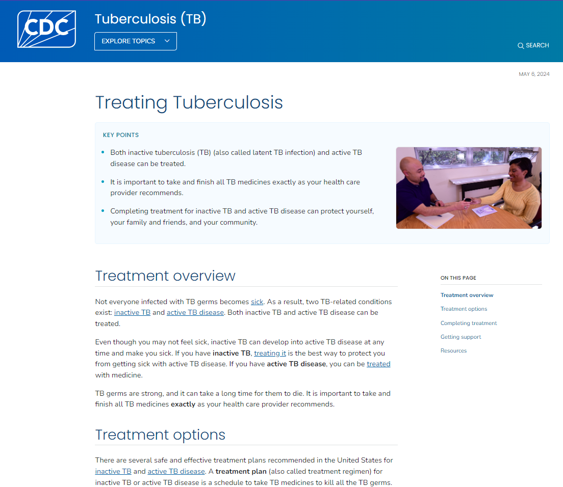
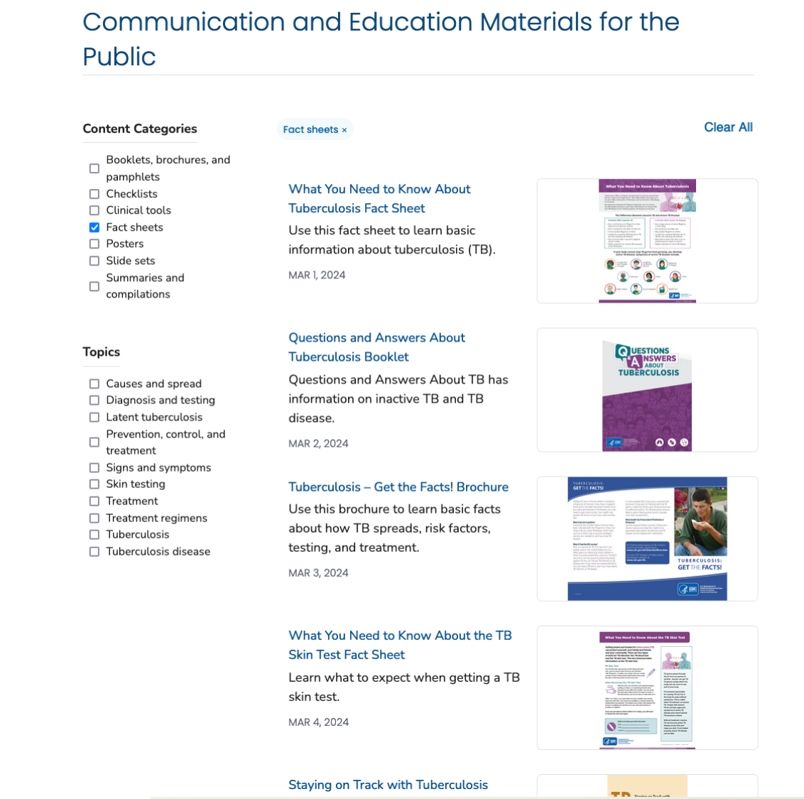
This new navigation model and design has been rolled out agency-wide at CDC.gov as part of a 2024 CDC relaunch, providing a consistent, user-tested experience across the site. These efforts have greatly improved users ability to locate information both within and across CDC pages.
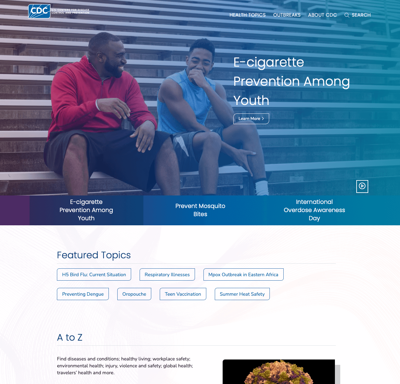
In addition, we were able to create a unified design/ layout across all CDC sites, which strengthens the sense that CDC program sites belong to a single cohesive organization rather than operating independently. These efforts led to a 94% task success rate among users for navigating across pages to find information and a user satisfaction score of 92%.
I’ve had trouble before navigating the CDC website. I found it very easy to navigate compared to previous times. I’ve checked it over time to keep up with Covid. I find this a lot easier to navigate than that or about the flu.
— research participant —
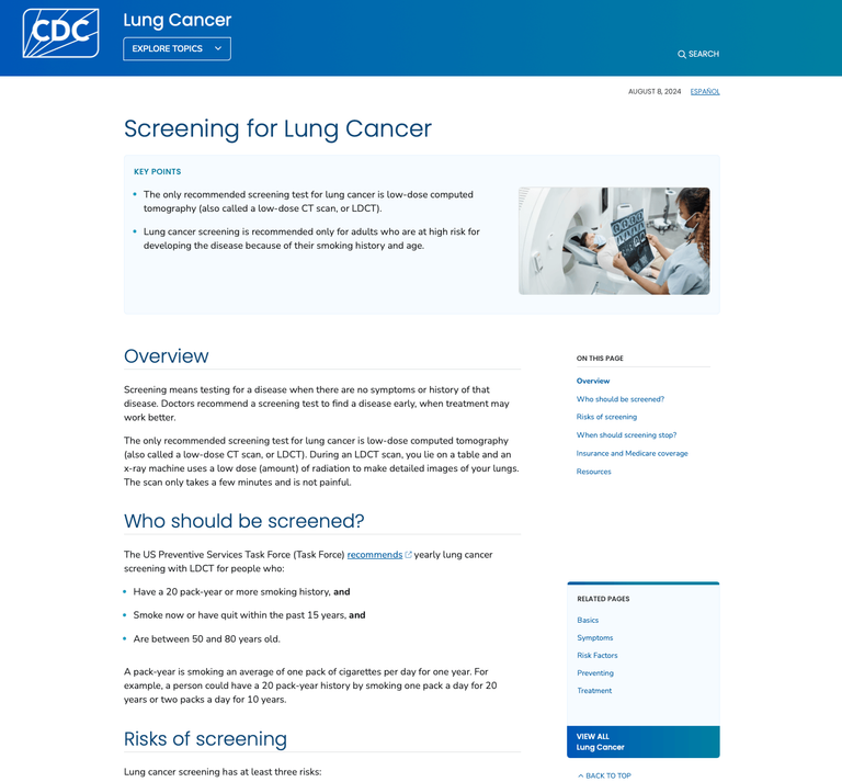
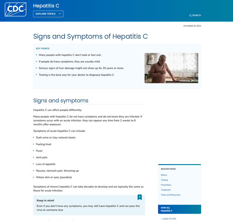
NEW CDC content pages from 4 different program sites:
