Dengue data visualization
The Problem
Dengue Fever is a major global public health concern — 40% of the world’s population is at risk for developing Dengue Fever (CDC 2014) and it is estimated that there are 390 million new cases each year. Major widespread outbreaks are on the rise and are overwhelming medical and relief services.
Because Dengue is transmitted by mosquitoes, there is a known relationship between climate and outbreaks. But how exactly and to what degree these different variables contribute to outbreaks is not as well known.
The goal of this project is to build interactive visualizations to help understand the relationship between complex climate related variables and outbreaks in order to support the task of forecasting future outbreaks.
What I accomplished
- Conducted extensive secondary research across multiple disciplines to inform approach and design.
- Conducted CDC Subject Matter Expert (SME) interviews to gain
knowledge on what insights the interactive data visualization should
provide. - Sketched design concepts eventually translating them to high-fidelity concepts.
- Used D3.js to develop functioning data visualization.
Target users
The users of our interactive visualization would be policy makers, medical staff, relief workers, and researchers. Policy makers and relief workers would be interested in knowing if Dengue cases are on the rise so as to allocate more funding for efforts to combat infections. Researchers and medical staff are interested in better understanding how climate influences outbreaks in order to predict future incidents. Additionally, these individuals would be interested in understanding if there are regular temporal patterns in the outbreaks.
Research
Conducted extensive secondary research in the areas of biological characteristics of the Dengue Fever, mathematical models of its transmission in various countries, temporal and geographic transmission trends, and previous prevention efforts.Learned that human-created factors unrelated to climate influence the transmission of dengue including rain-water collection or housing conditions.
Design
Final design
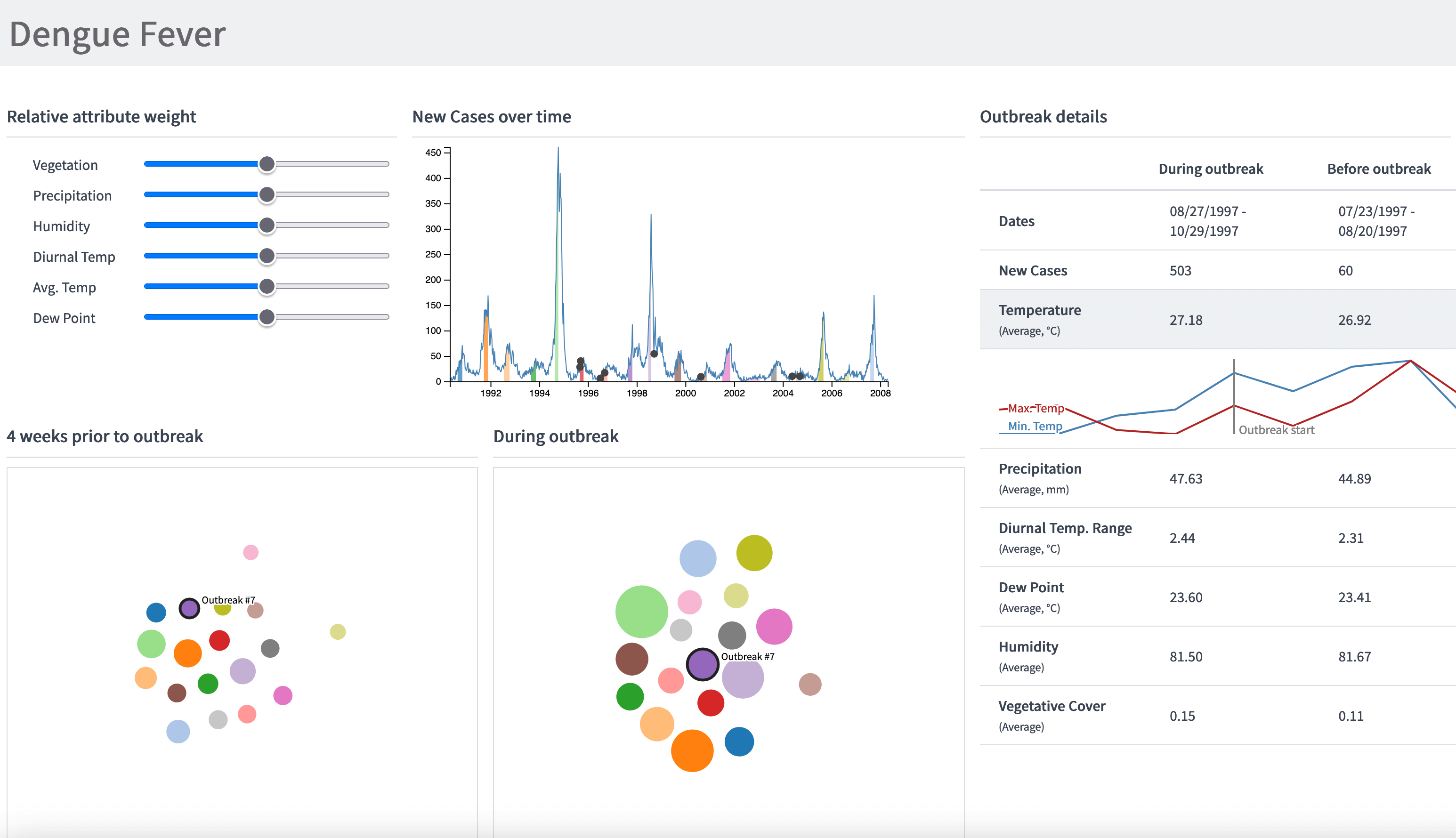
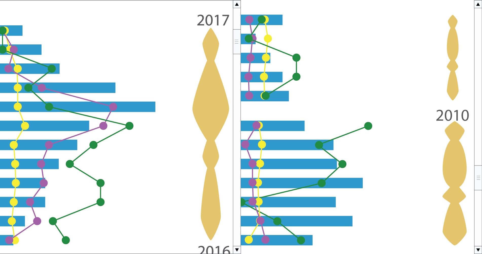
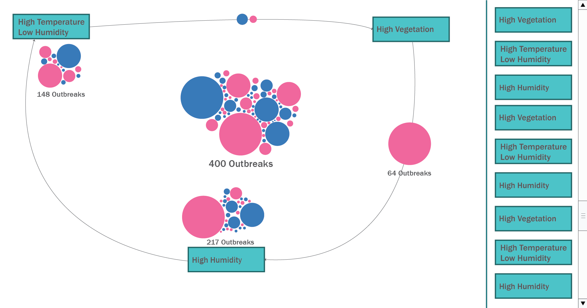
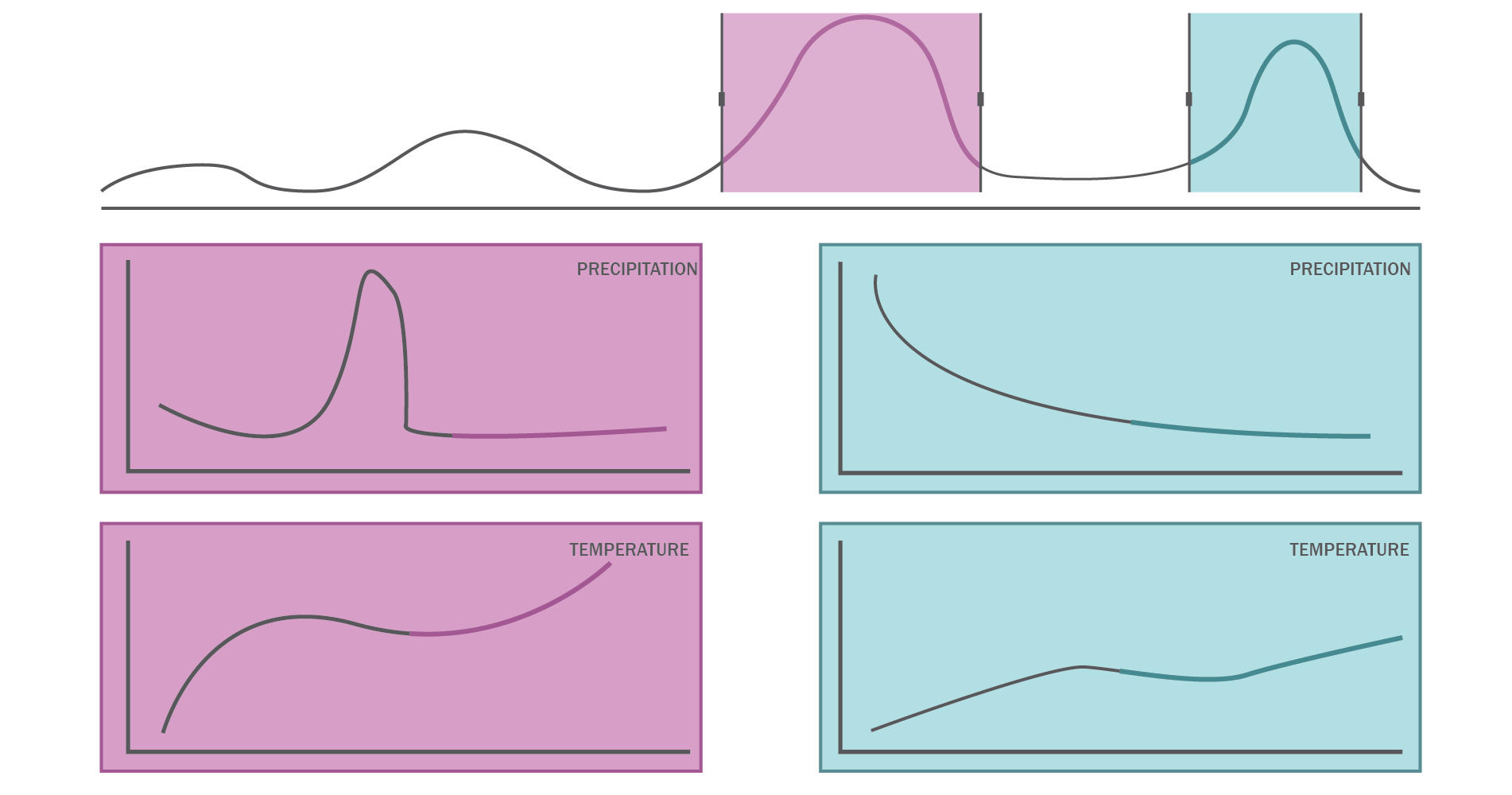
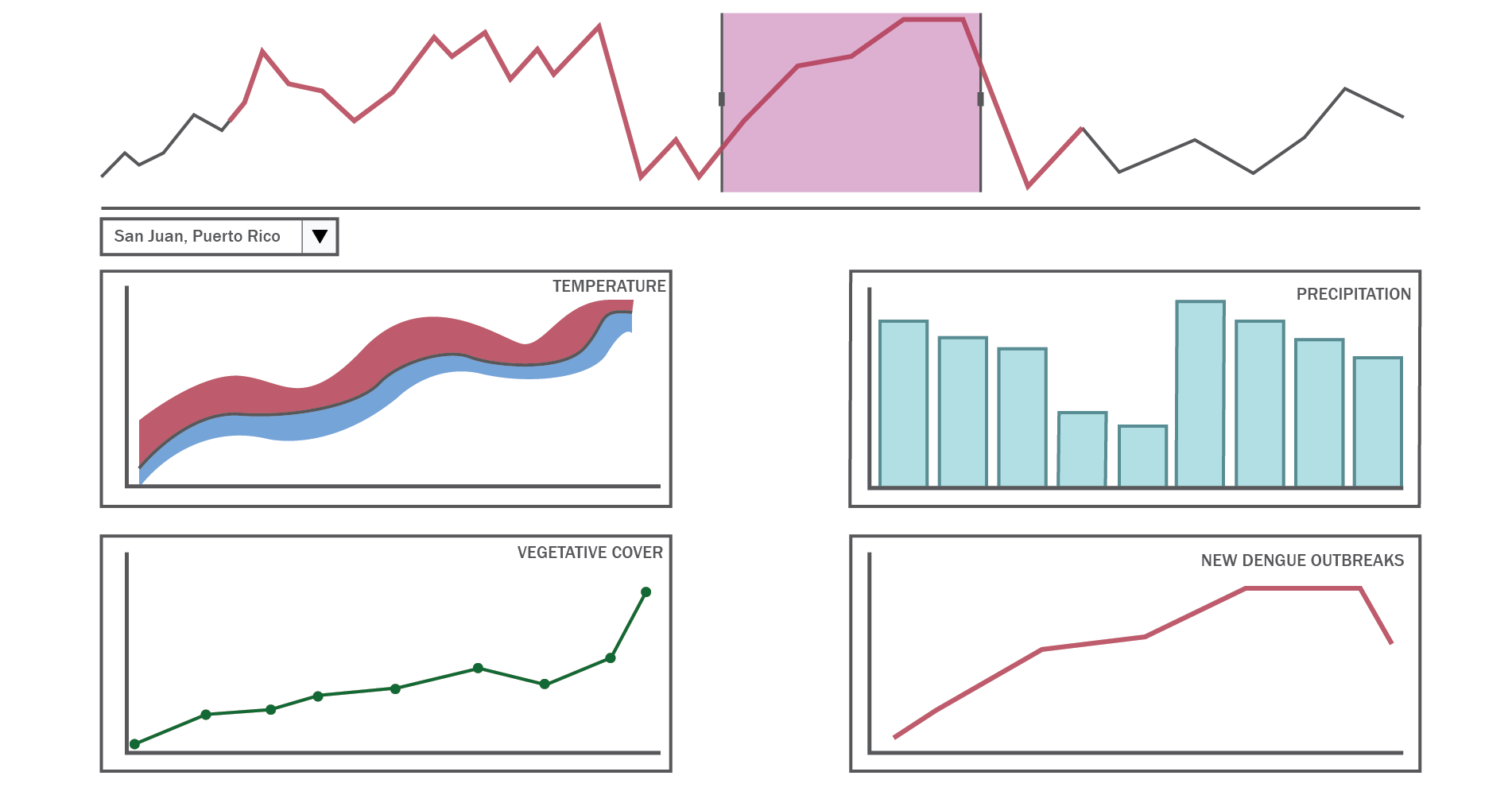
Inspired by visual analytics systems, our tool gives users a way to manipulate the clusters of outbreaks and uncover the importance of certain aspects of the data. Additionally, through the use of tooltips and side panels, users can dig into the data to see the fine-grain details and form conclusions.
View Interactive Visualization
Interactive visualization walkthrough video: