Toll of Tech: branding
Overview
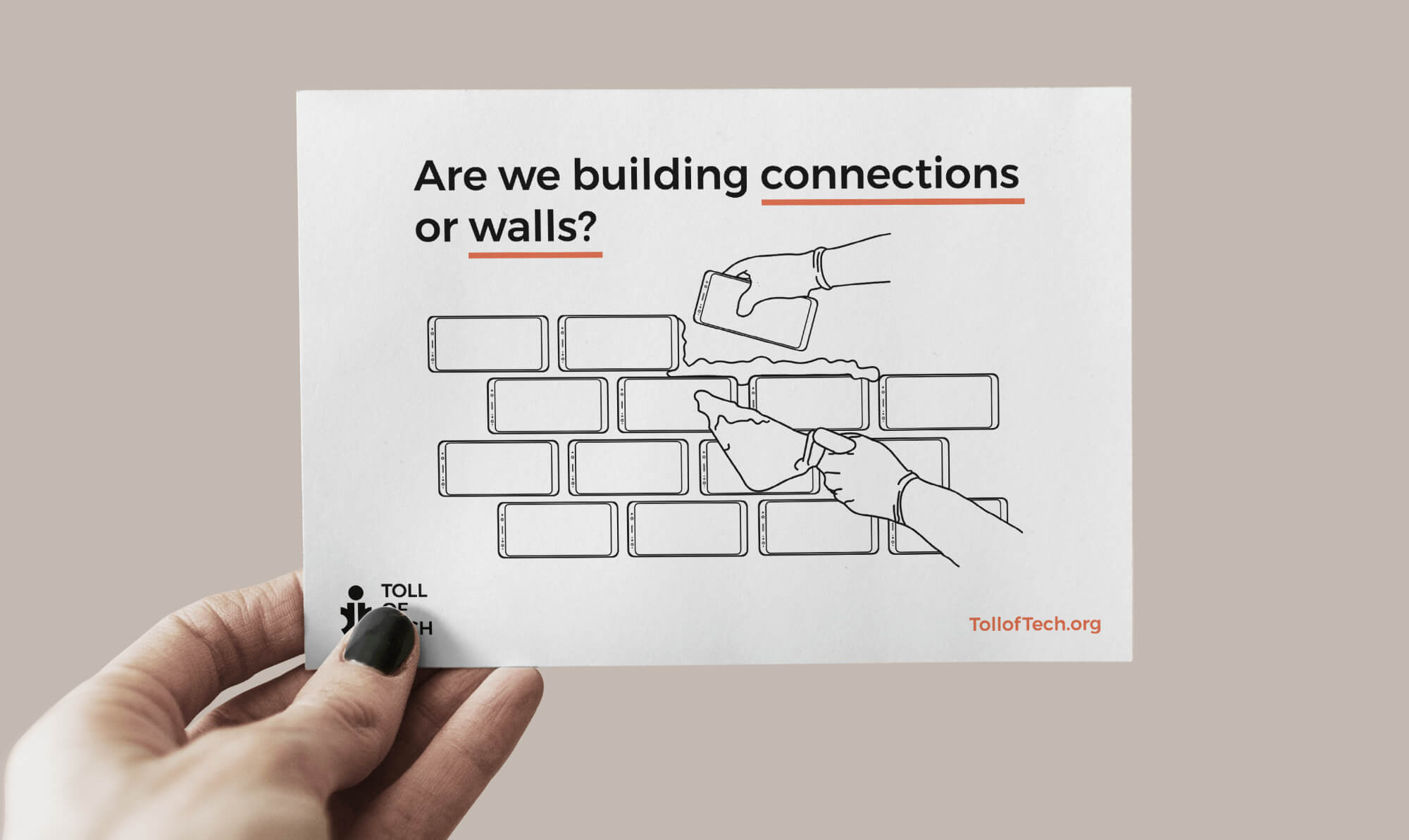
I iteratively designed branding guidelines for Toll of Tech — a nonprofit concept that I developed aimed at critically examining technology's role in our lives.
What I accomplished
- Initial branding research and development of business model canvas
- Identification of basic organizational identity elements and touchpoints
- Logo design as well as choice of color, imagery, and typography
- Compilation of branding guidelines and design of polished real-life touchpoints
View Complete Brand Guidelines
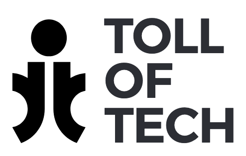
Brandmark iteration
A goal behind the design of the brandmark was to incorporate initials that makeup the name Toll of Tech — tot. As you can see, a number of design concepts for the logo were developed but the logo in the bottom right is what eventually became the final version. In this version, the initials are arranged in such a way that represents an image of a human being. This is important to the brand because it emphasizes the importance of people in relation to the brand. The logo can positioned side-by-side the same logo in a grid-like way to represent community and unity among people.